Production Design, Art Director, Director of Concept Design, Digital Animation
Filmmaking is, by its very nature, a collective process involving dozens, if not hundreds of collaborators. However, unusually, writer/producer/creative director Joe Moe and I were able to work together for nearly a month of intensive development prior to the director, Bruce Dickson, coming on board. A wealth of visual material was completed by the time pre-production went into full swing. As a result, much of our original visual design was fully realized in the final film.
This portfolio goes into detail about my contributions to the film and its design. If you haven't already seen Red Velvet, I hope that you will watch this entertaining thrill ride -- a smart updating of the boogie man horror genre -- because it's rich in details that are intended for fans to discover on repeated viewings (see Easter Eggs, below).
Red Velvet takes place between two worlds. The first is the everyday "reality" of Aaron (Henry Thomas), a dark and twisted storyteller, and Linda (Kelli Garner), his high-drama neighbor who is drawn towards Aaron's tales like a moth to a flame. The second world is the fantasy realm of Aaron's stories about his criminally disfunctional family past and the freaky horror tales he spins to lure Linda deeper into dark imaginings.
Joe's first mission for me to work on was to create distinct styles for these two worlds. My touchstones were James Bidgood, Kenneth Anger, Cindy Sherman, Pierre et Gilles, Japanese erotic photographer Shun Kochi, and the opening scene of Hiroshima Mon Amour where naked lovers are alternately covered in sweat, glitter and ashes. Contemporary fashion shoots employing similar "sexy dirty" styling were also inspirations and the look for this world was quickly nicknamed "Glamor Lake."
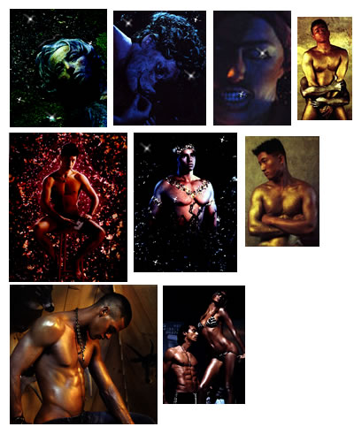
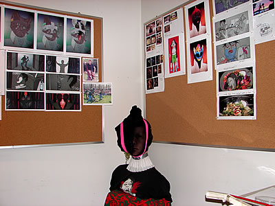
Above, one of many collections of images we pinned on the art department wall for inspiration while designing the fantasy world.
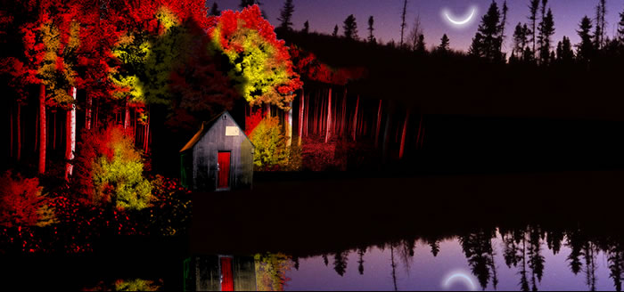
Above is my concept collage for Glamor Lake, depicting the proposed candy colors of the fantasy world. For subliminal unease, I referenced the tiny, tarpaper shack of Unabomber, Ted Kaczynski. The red door is an element that is repeated throughout the film, one of many "Easter eggs" planted for the enjoyment of repeat DVD viewings. To me, the red door symbolized a magical portal between the realms of good and evil. Watch for it, especially, as it sparkles on the cabin lampshade (one of many superb touches by art director/set decorator Courtney Tuesday Yates) just prior to the Mother's suffocation. The horn-like crescent moon is from Edgar Allen Poe's poem, Ulalume, and our film production company, Ulalume Films.
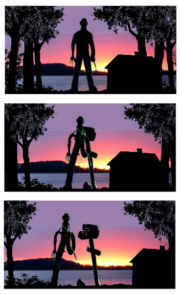
The shack in the firey woods as it appears fleetingly in the film during the opening credits and again when Pat and Amy discover the corpses of Roy and Jenny.
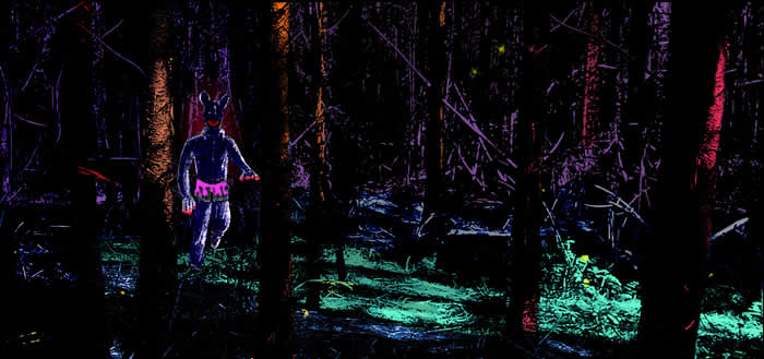
My concept design of the maniac lumbering through the woods earned him the nickname "Woodsy" and gave the production staff the creeps.
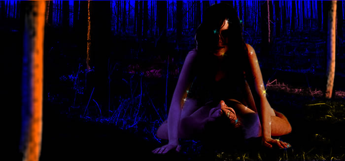
Another concept collage for the lurid coloring and sparkling skin at Glamor lake.
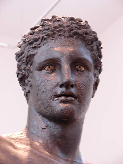
To create an iconic new movie monster, I thought it fitting that the maniac should be born from the idealized classic Greek proportions of this haunting statue of Apollo in the Athens Museum.
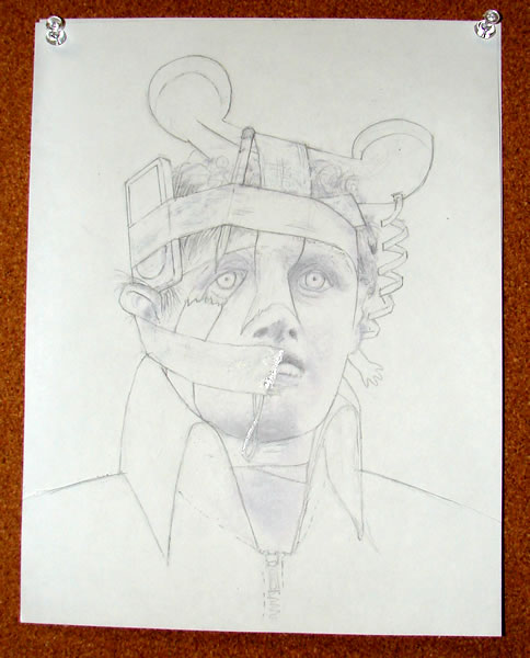
Above, my first concept sketches for the maniac, incorporating telephone "ears", an iPod, a rubber band, pencil, and a doll arm, all held together with duct tape. Joe Moe wanted the maniac to gradually accumulate bizarre items from the cabin, tool shed, along with mementos from his victims. He also wanted the ultimate outline to be distinctive and instantly recognizable. Back in the day, Joe and I had gone to a West Hollywood Halloween street party and, for his make-up, he emptied his trashcan and glued all the contents onto his face. The result was unexpectedly creepy and disturbing, and it was certainly in the back of my mind when drawing this.
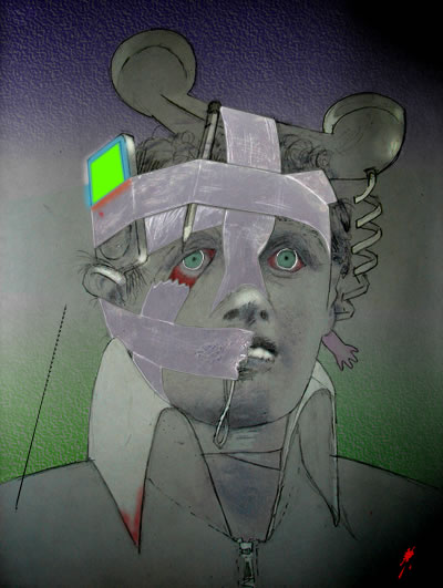
Joe wanted a striking profile to dominate and the addition of a nylon stocking unified the form and made the exact identity of the items more mysterious. The iPod is now also transmitting messages in addition to sounds.
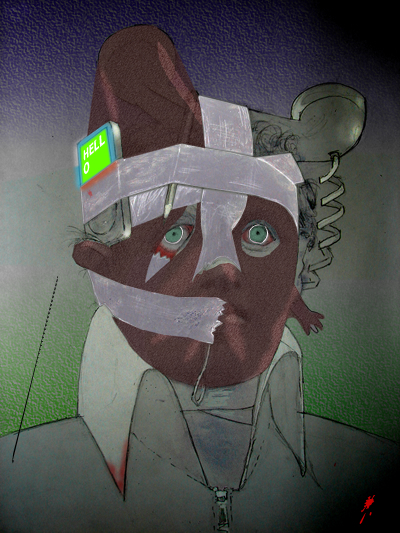
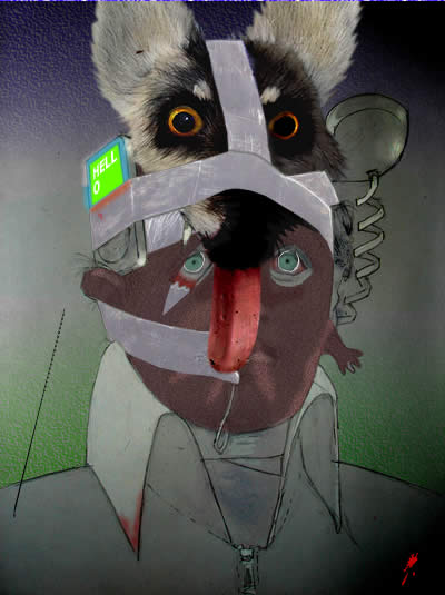
An abandoned iteration adding an animal skin.
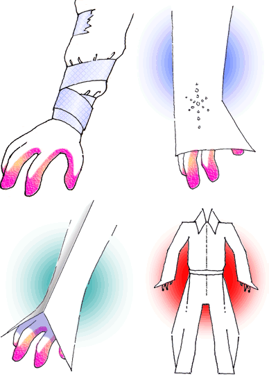
My early concept sketch for the maniac's costume included more duct tape, pink rubber finger-tipped gardener's gloves to match the pink toolbelt, an Elvis look, and an Issey Miyake-ish origami look. The gloves remained into the final look.
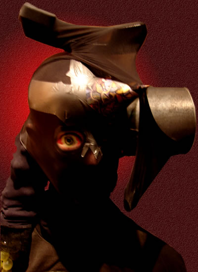
A 3D mock-up I put together during a lunch break using a watering can, telephone, nylon, bloodshot single eye, paper party hat and a bunch of plastic grapes (!) that Joe found. The single eye and the skull-like trident nose piece of duct tape orginated at this stage and remained into the final design.
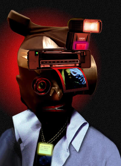
Here, I added the "Horroroid" head gear with flash unit, a lens for the eye, and a zipper mouth which I quite liked. One of my vivid childhood memories was the creepy masks from the Disney TV series, The Scarecrow of Romney Marsh, and I think that is echoed here.
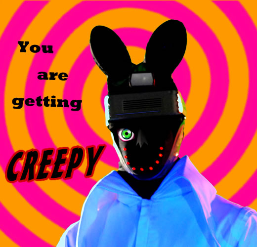
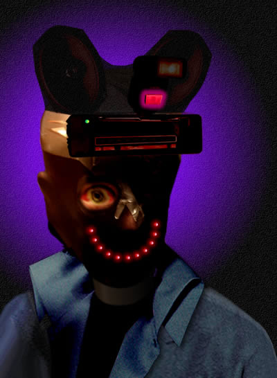
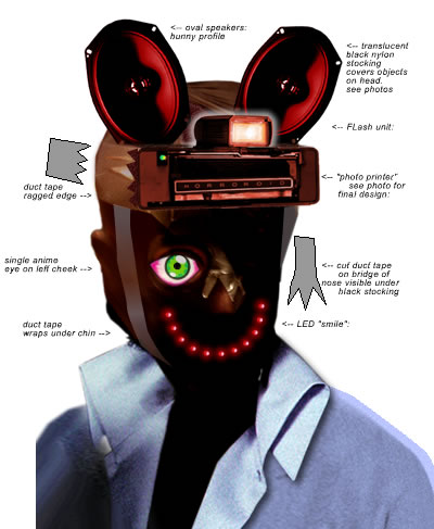
The penultimate design incorporated hexagonal car speaker "bunny ears" (production designer Justin Corrigan added springs to these in the hero headgear to great effect) and an LED smile. I'd always imagined that if evil aliens were to land on Earth they would try to disguise themselves as non-threatening happy faces, with an untintentionally horrific result that I think is proved out here. I designed a cartoon "anime" eye for the final version (see below).
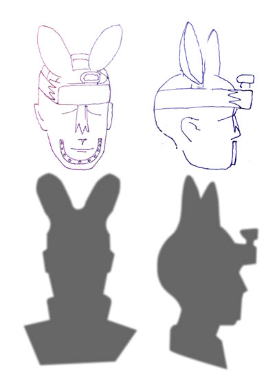
Sketch of the innards and profile of the final maniac.
Final design of the head gear forwarded to the production and wardrobe teams.
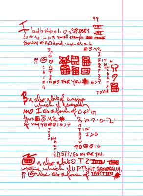
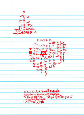
Originally Aaron's writing in his journal is a key narrative thread with a shock pay-off at the ending when it is revealed that he was plotting Linda's demise all along. This key element was downplayed during the shoot and the journal now briefly appears in the opening credits and again when Aaron grabs his journal as he departs for the cabin.
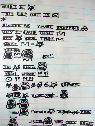
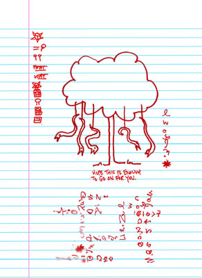
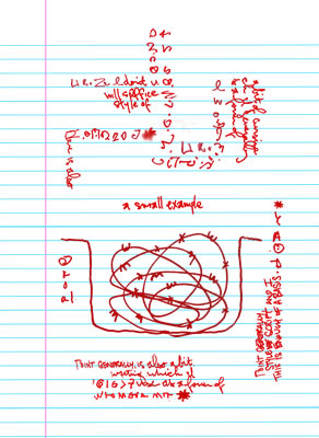
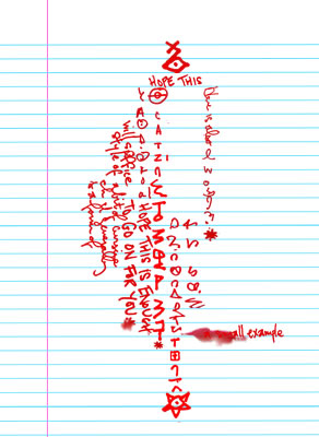
One of the pages from a sketchbook I kept when I was developing the maniac script. It includes actual lines from the laundry room scene written in his secret code. The symbol in the first line is "monster", which is the basis for Aaron's personal symbol -- the star with the T shape in the center. Aaron's symbol appears throughout the film: on the laundry window, on tattoos, in UV chalk inside the shed. Linda's glyph is also on this page and is the maniac's symbol for "shut up." Henry Thomas provided handwriting samples which I then combined with text and maniac symbols to created a variety of pages for Aaron's notebook, seen briefly in the opening credit sequence as he struggles to concentrate on his writing. The snakes hanging from the tree (above) and the barbwire pit (below) were some of the traps that Aaron had planned for Linda before she was a no-show at the birthday party at the cabin. The scenes from the script where Aaron explains this to a drugged Linda were never shot.
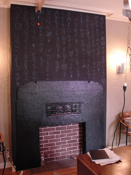
On the set of Aaron's apartment. I covered the chimney with maniac symbols in blue chalk, seen during the opening credits which also incorporate the symbols into the titles.
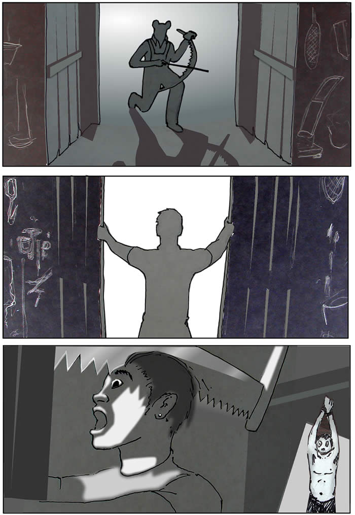
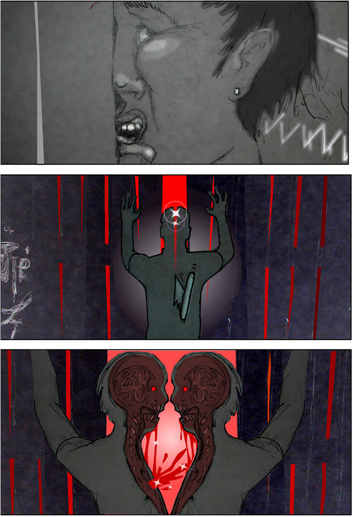
Here are a selection of my concept sketches for key scenes and the final result:
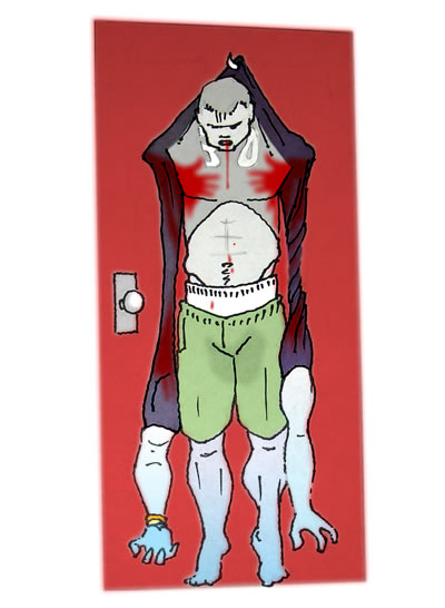
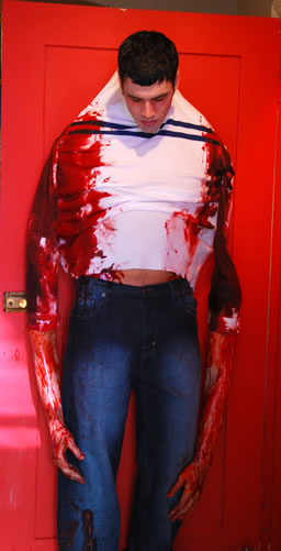
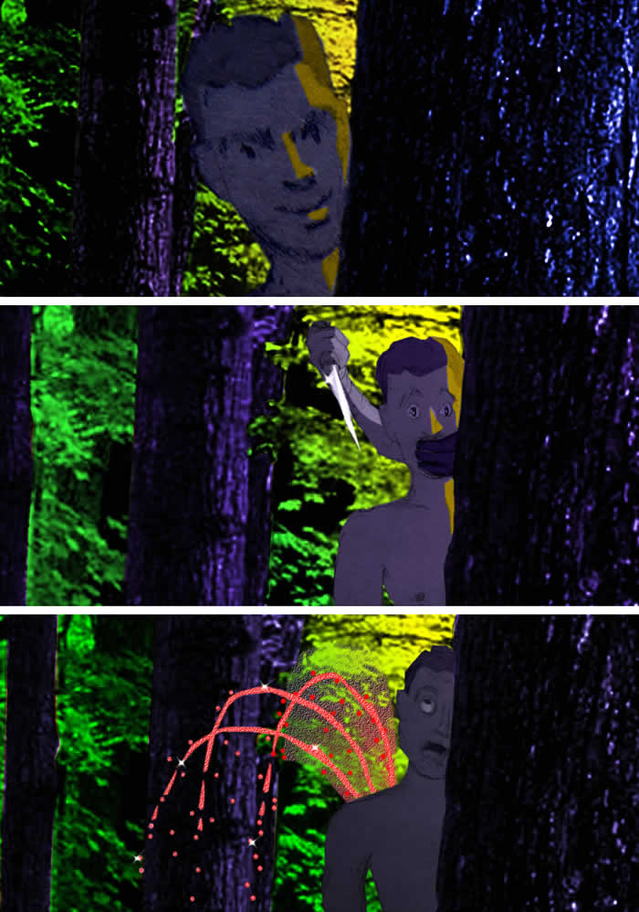
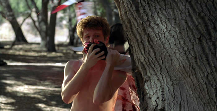
The demise of Kyle (Jordan Hagan). Note the subtleties in my original sketch - hook, gravity, jersey number emphasizing gravity, skin color change, bare torso, blood handprints, urine stain - unfortunately absent in the film (production pic on right by Lucky Smith).
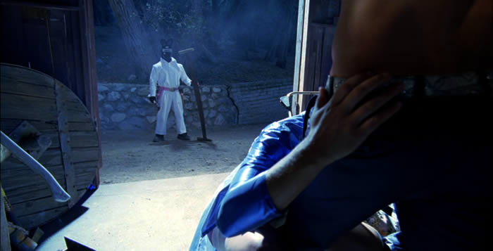
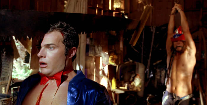
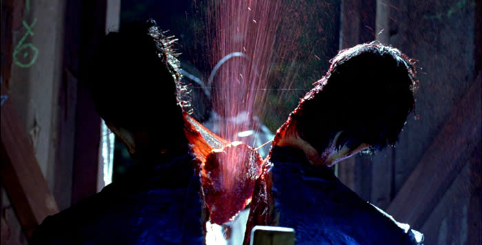
The shed sawing sequence was filmed nearly as designed (as the screen shots above show). The face/vase "kiss" in the final sketch was actually designed into the torso puppet, however the amount of blood spray made the puppeting rods too slippery to manipulate and so this "twisted" shock ending to the gay make-out scene was not caught on film (note the light coming through the empty eye sockets). I hand-animated the pink digital sparkles that accent the blood spray in the final film.
Concepts and original footage (sans colorization and effects) for the stabbing of Roy (Eric Jungmann). Joe wanted big, wheezing fountains of blood, samurai-movie style. To accomplish this, I suggested shooting soy milk against a black backdrop to create high contrast fountains of blood and it worked beautifully! I manually positioned the resulting takes of individual soy milk spurts onto the film image: rotating, squashing and stretching them to create the icky physics for the exponentially increasing stab wound spray. Grouped, these were then sent to a CGI artist to clean up, colorize and to add 3D liquid highlights. Finally, I added more animated "fantasy world" sparkles onto the blood spray to complete the effect.
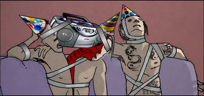
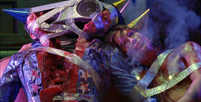
The birthday boy (Bret Roberts) and his bf (Ryan Doom) reunited with the help of duct tape.
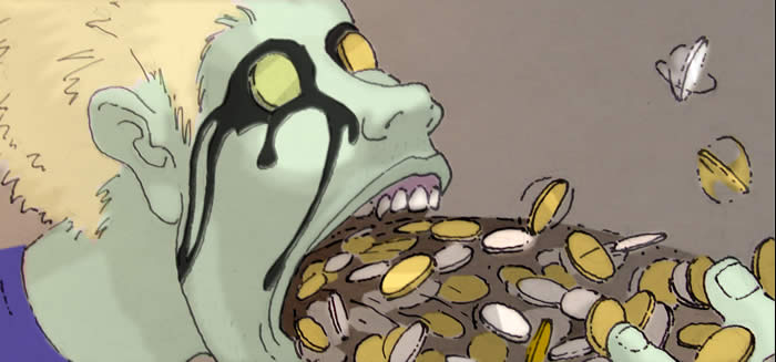
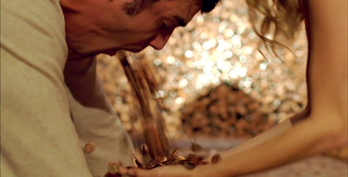
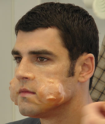
The coin vomiting scene as designed and filmed. The coins over the eyes and black ooze were abandoned concepts. The final film shot is not lit to the best advantage for the effects, as was often the case in the short shooting schedule. Effects shots were usually left for the end of the day, when everyone was tired, and given the least amount of time to prep, light and film. Some gorgeous make-ups (Kyle's cheeks stuffed with coins, for example, seen in application progress below) were shot without accent lighting.
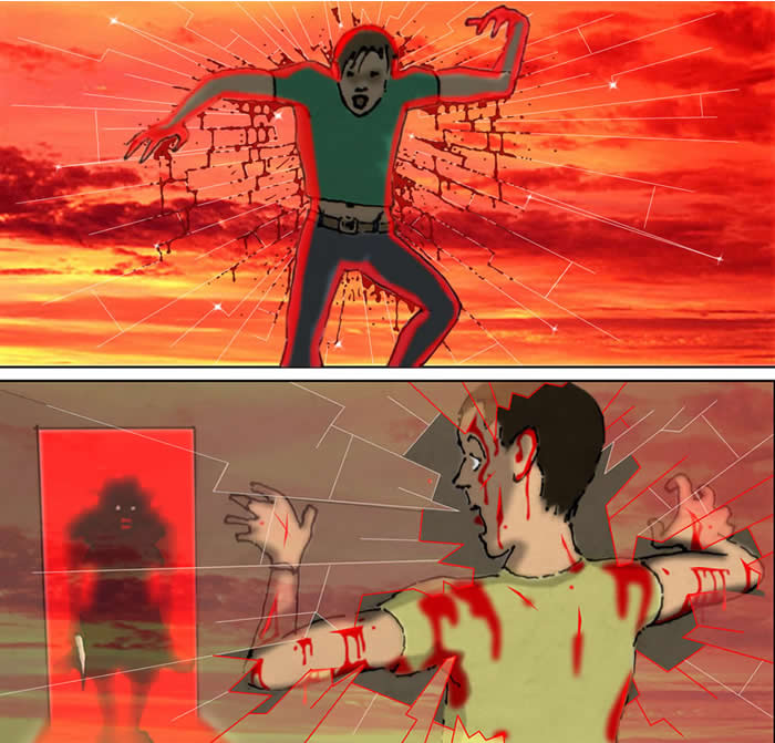
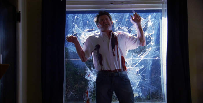
The biggest disappointment for me was the short shrift that Joe's original "fly trapped in a glass web" ending was given. So much time was spent dealing with actually breaking a huge sheet of candy glass when Aaron is supposed to get stuck in the glass, not go through it. It could have been assembled in the computer much more easily. Above are my concept sketches (I LOVE the Mother Monster). Very different from the resulting film footage (seen above without the CGI sweetening of slowly spreading blood along the cracks of the glass).
Above, a cool concept sketch: I hoped to include a number of momentary optical illusions (Salvidor Dali called these "paranoid critical" images) that would form briefly, at just the right angle, as the camera moved. Good idea, but too much work for the art department on our tight production schedule.
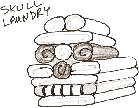
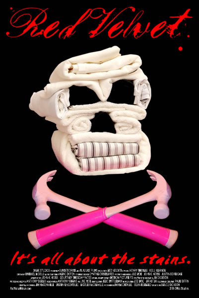
My original idea: the skull laundry pile. The image of the skull was meant to appear only momentarily as the camera moved around it, however in the film it is stationary and so less an ephemeral startle as originally intended. It has become quite a memorable "mascot" for the film however and I think it would make an excellent plush toy!.
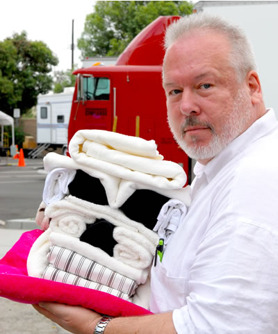
Me on location with the final skull-shaped pile of laundry for the scene in "Roy's Wash 'N Fluff." I constructed the prop on site using towels, sheets, socks and a glue gun. The top towel is unattached so that the actress could be seen in the process of folding and stacking the laundry.
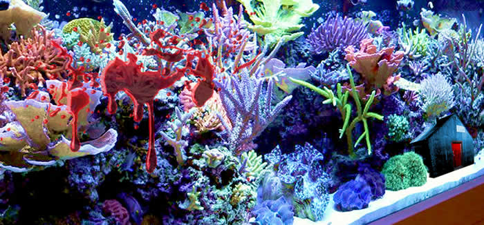
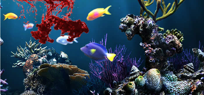
Yet more Easter eggs: a miniature cabin (bottom right) designed to appear inside the fish tank as it gets splattered with blood. In the film, the cabin was changed to a red barn during the Thai restaurant scene and a bubbling alligator (reference to a scene I contributed to later in the film) appears instead during the blood splash from the ninja attack.
One of Joe's great ideas that didn't make it into the film: he wanted the fish to nibble on the blood as it splattered into the tank. Here's what we had in mind.
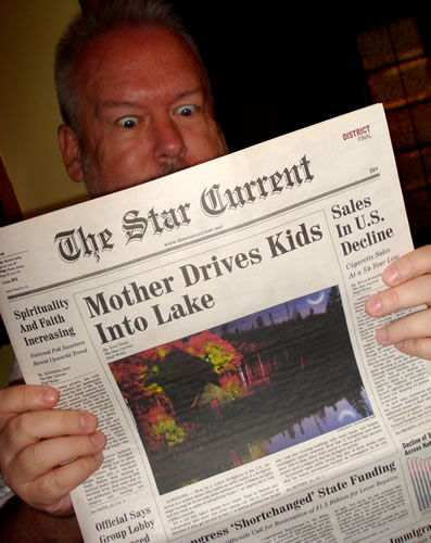
The prop newspaper used in the family dinner fantasy scenes. Note the maniac's cabin concept sketch used under the headline.
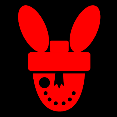
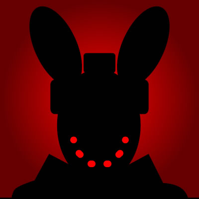
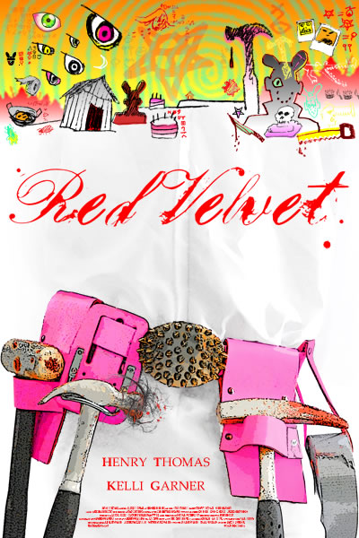
I drew the maniac icons above and used them to create the cartoon collage for an unused poster concept by Joe Moe (below).
My DVD insert art.
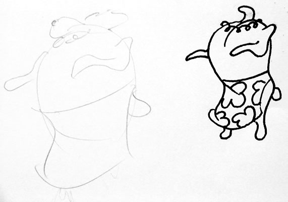
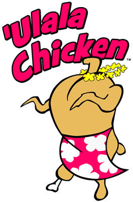
Joe's original doodle for the "Huli Chicken" logo (left), which I loved, and my clean-up on the right. The name changed for copyright reasons and the final result is seen below. 'Ulala means "insane" in Hawaiian. Linda wears this t-shirt (substituted for the Zankou Chicken shirt in the original script because of the real-life 2003 "Zankou Chicken Murders").
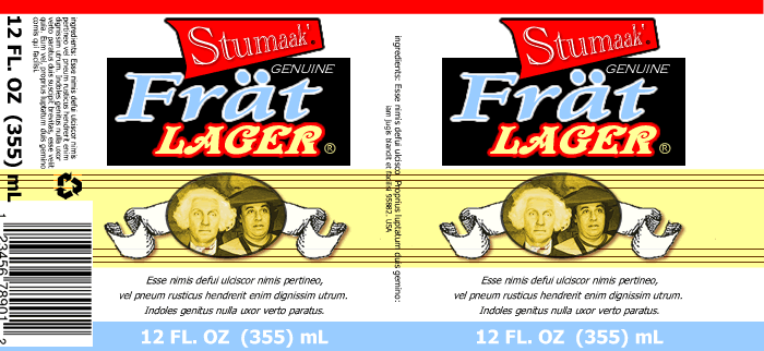
One of two beer labels I designed for the movie. This one features Joe Moe and George Washington. Joe suggested the name of the beer, Frät Lager. "Stumaak" is a pseudo-Thai expression I made up incorporating Joe's sister Jaymie's term, "stuuuuu" (stupid) and the Thai word "maak" (very).
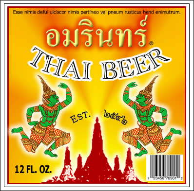
Amarin, a fake Thai beer, is named after my life partner (Amarin Ratanarat), who also assisted during the filming of the spinning blood backgrounds and "soy blood" spurts for Roy's stabbing scene. My designs for avatars and mascots.
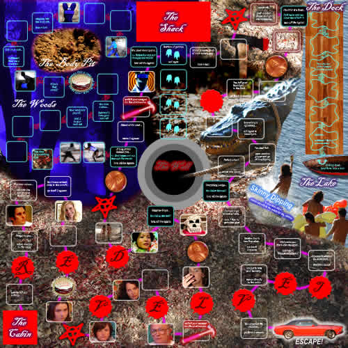
My super cool Red Velvet Board Game design with turn-out-the-lights glow-in-the-dark maniac chase sequences and alligator pit trap. Players get to be characters from the film and attempt to escape with their lives.
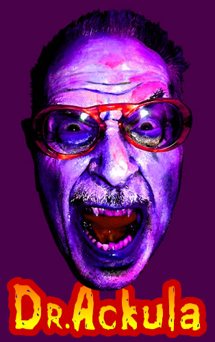
My "painted" design for the Forrest J Ackerman fan t-shirt worn by the character Roy in the film, based on a photo by Joe Moe.
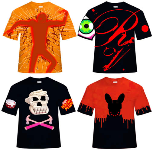
Four of a dozen t-shirts that I designed.
My inspirational flyer posted on the door of our art department office during pre-production.
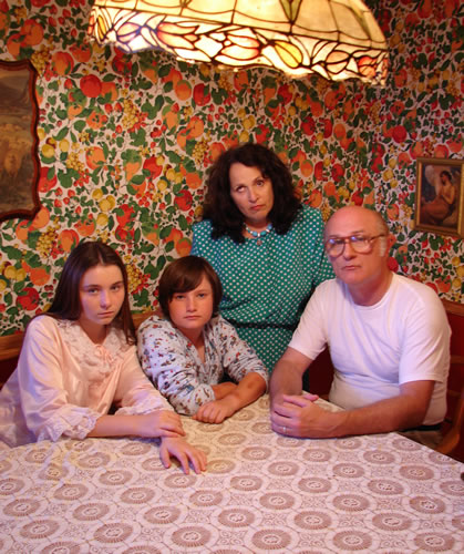
My "Addams Family" shot of Aaron's family on set, including my friend and actress Carol Ann Susi as the Monster Mother.
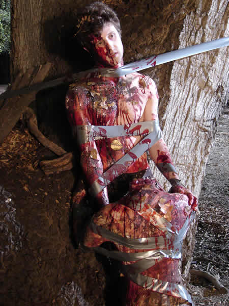
I posed and art directed Roy's "headless blowjob" death tableau, glimpses only briefly prior to the maniac chase through the woods at Sable Ranch.
The sequels "Black Forrest" and "Devil's Food." You may be surprised who the maniac turns out to be!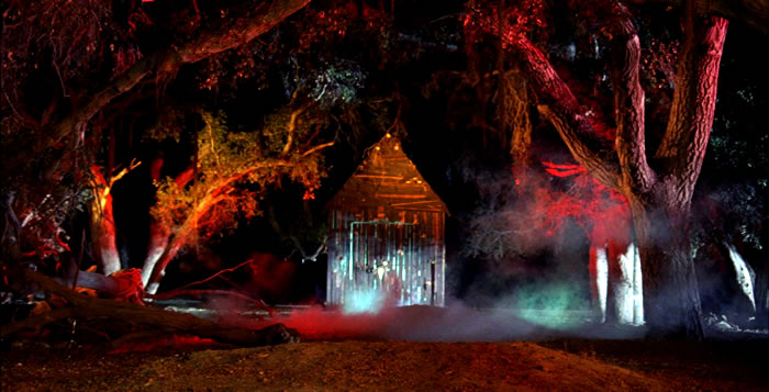
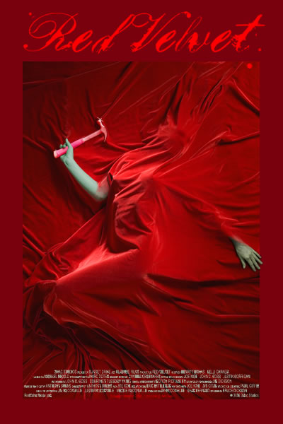
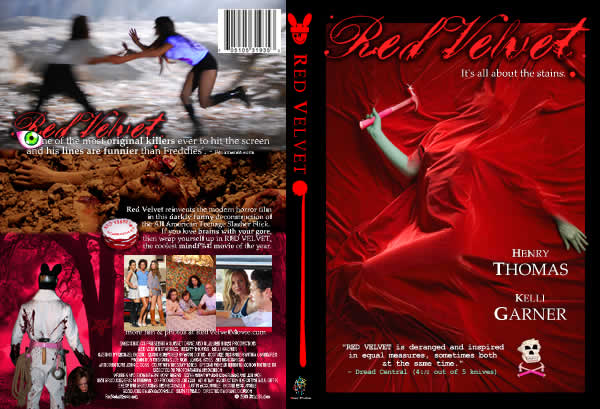
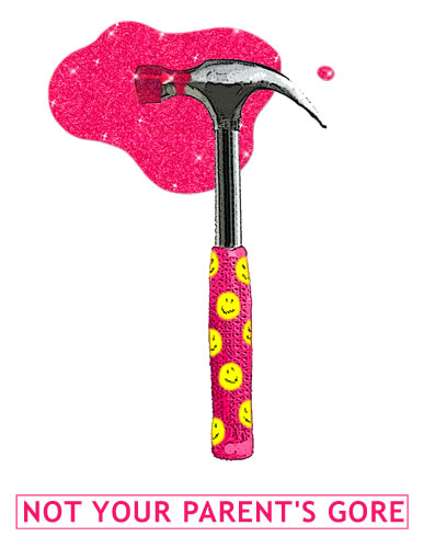
My concept for the above was based on the famous calendar shot of Marilyn Monroe on red velvet. I assembled this final image from multiple shots of a real model (producer Sean Fernald's wife, Silke!) under velvet and with a prop "pink hammer" from the film. I did a great deal of digital retouching to achieve the final result. I love the fingers extending slightly beyond the "frame."
![]()
Here's an Internet banner you can steal and post on your own blog or website by right-mouse-clicking: